Installing and running Gnuplot on FreeDOS.
In my tutorial Introduction to Gnuplot, I describe how to install and use Gnuplot 6 on Windows 10. This tutorial is about the usage of Gnuplot 4 on a FreeDOS 1.3 RC5 VMware virtual machine. I think that version 4 is the last one that supports DOS operating systems. I did not try, but I suppose that the tutorial also applies to MS-DOS and others.
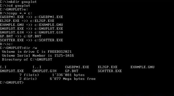
Gnuplot 4 can be downloaded from nomdo.nl. The download archive contains the program's filesystem. I unpacked it on my Windows 10 and transferred the files to my FreeDOS machine using a floppy diskette. The screenshot shows how I copied the files to the directory C:\GNUPLOT.
|
Gnuplot for DOS is not an interactive program, but is run with a command line argument that specifies the name of a file, containing the Gnuplot commands to create a given plot. Output is normally to the screen. It seems that the only file output supported is postscript (cf. EXAMPLE.GNU); I did not try it out...
My FreeDOS machine has three partitions, and all my sources are located in some subdirectory of D:\DEVEL. For my Gnuplot command files (and the associated data files),
I created the directory C:\DEVEL\GNUPLOT. And I created the batch file GP#.BAT (placed in a directory that is part of the executables path) with
the following content:
@echo off
set path=%path0%;c:\gnuplot
d:
cd \devel\gnuplot
set _gp=%1
if exist %_gp% goto End
set _gp=%1.plt
:End
set devel=gp
gnuplot %_gp%
set _gp=
First, the Gnuplot directory is added to the PATH environment variable. Note that %path0% used here has been set to %path% in my FDAUTO.BAT (keeping a variable that contains the "basic" path). Then the current directory is set to the directory that contains the Gnuplot command files. The script requires one argument, that is the name of the file with the Gnuplot commands to be run for the actual plot. The default file extension is .PLT (the script looks if the file specified exists; if yes, it is used, otherwise the script adds the .PLT extension). The environment variable "devel" is a custom variable on my system; you can ignore it. Finally, the script runs GNUPLOT.EXE with the Gnuplot command file name as argument.
I was surprised not only about the pretty graphs created, but also that I could mostly use the commands that I used in my examples with Gnuplot 6 on Windows 10. The rest of the tutorial consists of these examples. They are shown without further explanations. If you are new to Gnuplot, my Windows 10 tutorial might be helpful. You can also download the Gnuplot command files and associated data files from my site.
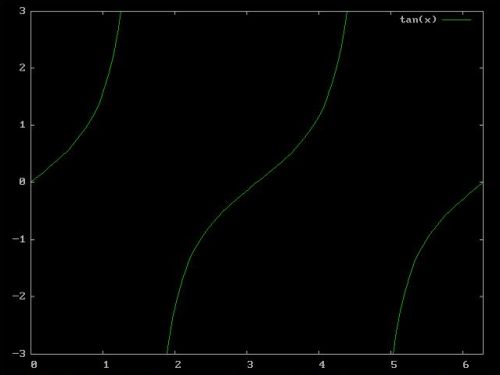
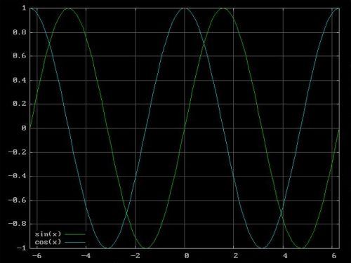
The two screenshots below show the output produced by running the commands of the file TANGENT.PLT (plot of the tangent function for x = 0 to 2π; on the left), resp. of the file TRIGO.PLT (plot of the sine and cosine functions for x = -2π to 2π; on the right).
Here are the commands of TANGENT.PLT:
set xrange [0:2*pi]
set yrange [-3:3]
plot tan(x)
And those of TRIGO.PLT:
set grid
set xzeroaxis
set yzeroaxis
set key bottom left
plot [-2*pi:2*pi] sin(x), cos(x)
|
|
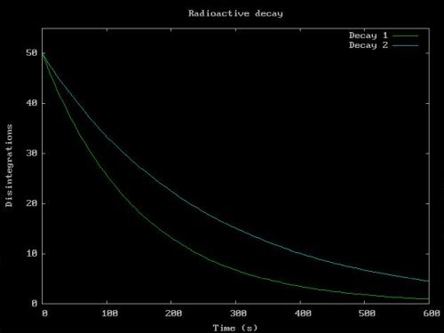
The commands in the file DECAY.PLT create the plot of the decay of two radioactive substances.
set title "Radioactive decay"
set xlabel "Time (s)"
set ylabel "Disintegrations"
set xrange [0:600]
set yrange [0:55]
plot 50*exp(-x/150) t "Decay 1", 50*exp(-x/250) t "Decay 2"
|
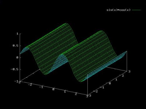
The commands in the file 3D.PLT create a simple 3D plot.
set zrange [-1.0:1.0]
set isosample 40
set hidden3d
set ticslevel 0
splot [x=-3:3] [y=-3:3] sin(x)*cos(x)
|
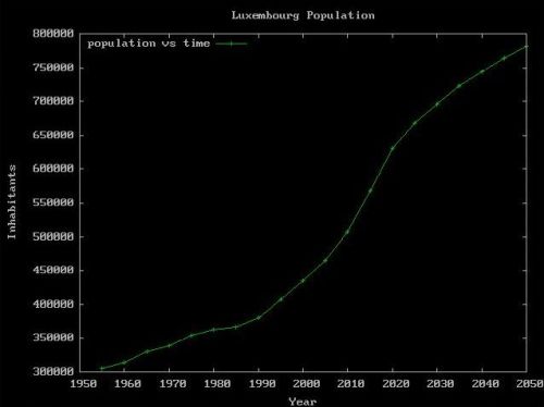
The following sample draws the graph of the number of inhabitants versus time in Luxembourg, based on the data of the file LUXPOP.TXT:
# Population Luxembourg
1955 305514
1960 314168
1965 329794
1970 339342
1975 353666
1980 363741
1985 366466
1990 381267
1995 407635
2000 435628
2005 464860
2010 507070
2015 569408
2020 630399
# Forecast...
2025 668100
2030 697086
2035 722516
2040 744884
2045 764687
2050 781910
Here are the commands of the file LUXPOP.PLT.
set title "Luxembourg Population"
set key top left
set xlabel "Year"
set ylabel "Inhabitants"
plot "luxpop.txt" t "population vs time" w linesp
|
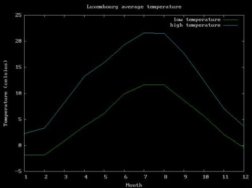
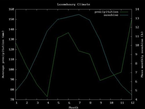
The following two samples draw graphs related to the climate in Luxembourg, based on the monthly average data of the file LUXCLIM.TXT:
# Climate Luxembourg: Monthly averages
# Col 1: Month
# Col 2: Average low temperature (celsius)
# Col 3: Average high temperature (celsius)
# Col 4: Average precipitation (mm)
# Col 5: Mean monthly sunshine (h)
1 -1.83 2.28 126.48 4.97
2 -1.81 3.30 104.24 6.40
3 0.81 8.16 85.39 8.89
4 3.71 13.29 73.05 11.62
5 6.16 15.94 131.64 12.88
6 9.91 19.34 136.79 13.17
7 11.63 21.57 118.61 13.44
8 11.70 21.52 115.55 12.82
9 8.65 17.74 89.01 10.60
10 5.66 12.41 93.15 7.27
11 2.09 7.10 97.57 5.65
12 -0.38 3.71 150.21 4.54
Here are the commands of the file LUXTEMP.PLT. The plot created consists of the graph of the average minimum and the graph of the average
maximum temperature per month.
# Luxembourg average temperature
# Average minimum and maximum per month
# Data from file "luxclim.txt"
set title "Luxembourg average temperature"
set xlabel "Month"
set ylabel "Temperature (celsius)"
set xtics 1,1
plot [1:] "luxclim.txt" u 1:2 t "low temperature" w lines, \
"" u 1:3 t "high temperature" w lines
|
Note that the minima graph is created from the file values in columns 1 and 2, the maxima graph from those in columns 1 and 3. Also note the backslash, that placed at the end of a line allows to continue a Gnuplot command in the following line.
Here are the commands of the file LUXCLIM.PLT. The plot created consists of the graph of the average precipitation per month and the graph of
the average monthly sunshine.
# Luxembourg climate
# Average precipitation and mean monthly sunshine
# Data from file "luxclim.txt"
set title "Luxembourg Climate"
set xtics 1,1
set ytics nomirror
set y2tics
set xlabel "Month"
set ylabel "Average precipitation (mm)"
set y2label "Mean monthly sunshine (h)"
plot "luxclim.txt" u 1:4 t "precipitation" w l axes x1y1, \
"" u 1:5 t "sunshine" w l axes x1y2
|
This two graphs plot has the particularity that there are two different, non-related kind of y-values: the average precipitation expressed in millimeter, and the average monthly sunshine expressed in hours. This type of plot requires two y-axes. For further details, cf. the explanations in my Windows 10 tutorial.
The following sample draws the graph (actually a bar chart) of the GDP (PPP) per capita for the richest countries in the world, based on the data of the file GDP.TXT.
# GDP per capita
# Col 3: Purchasing Power Parity (PPP)
# Col 4: Nominal GDP
1 Luxembourg 142214 127046
2 Singapore 127565 78115
3 Ireland 126905 105362
4 Norway 114899 106594
5 Qatar 114648 88046
6 U.A.Emirates 87729 53758
7 Switzerland 83598 92410
8 U.S.A. 76399 75269
9 Denmark 74005 67220
10 Netherlands 69577 56429
Here are the commands of the file GDP.PLT.
# GDP (PPP) per capita
# Data taken from file GDP.TXT
set title "GDP per Capita"
set xlabel "Country"
set ylabel "GDP ($)"
set boxwidth 0.75
set style fill solid
#set xrange [0:11]
set xtics ("LUX" 1, "SGP" 2, "IRL" 3, "NOR" 4, "QAT" 5, \
"ARE" 6, "CHE" 7, "USA" 8, "DNK" 9, "NLD" 10)
plot "gdp.txt" u 1:3 with boxes title "PPP"
The screenshot on the left shows the output generated by the commands shown above. The screenshot on the right is an ameliorated display, obtained by commenting out the command set xrange [0:11].
![Gnuplot on FreeDOS: Sample plot - Barchart of the GDP per capita [1] Gnuplot on FreeDOS: Sample plot - Barchart of the GDP per capita [1]](../screenshots/freedos_gp8b.jpg)
|
![Gnuplot on FreeDOS: Sample plot - Barchart of the GDP per capita [2] Gnuplot on FreeDOS: Sample plot - Barchart of the GDP per capita [2]](../screenshots/freedos_gp8a.jpg)
|
The particularity of this plot (as of most bar charts, but also other graphs) is that the values of the x-tics aren't numeric values, but some strings. With newer versions of Gnuplot these strings may be taken from the underlying data file, using the function xtics(), used to specify, as third value of the using option, the column containing the string values. This is not yet supported with Gnuplot 4. Here we have to include the string values in the command file, using the set xtics command. The option of this command has to be a list of numeric value - string value pairs, separated by commas. In our example, the string "LUX" will be used as x-tic value instead of the first column value 1, "SGP" instead of 2, etc.
You can see on the graph that the command set style fill solid does not fill the boxes, as it does with Gnuplot 6; maybe that there is another way to do this. Also, Gnuplot 4 does not support the linecolor command; here again, maybe that there is another way to use custom colors.
Finally, Gnuplot 4 does not support the histogram style, thus, plots like showing the nominal GDP and the PPP with the two bars side by side for each country (clustered histogram) are not possible.
If you find this text helpful, please, support me and this website by signing my guestbook.